
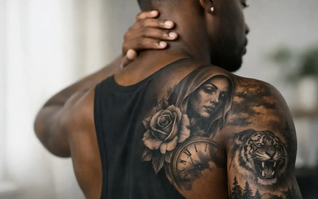
A black and grey tattoo should not disappear the moment it heals. On deeper skin tones, the goal is not to force a pale, washed-out look. It is to build intentional contrast, readable shapes, and a design that feels powerful from across the room and personal up close. Black and grey tattoos on dark skin can be striking, detailed, and long-lasting when the artist designs for the skin in front of them.
The difference comes down to planning. Skin tone, undertone, placement, design size, line weight, and healing all affect how a tattoo settles. A strong custom tattoo process respects those variables instead of treating every reference photo as a one-size-fits-all blueprint.
Why black and grey tattoos work on dark skin
Black and grey is often associated with soft portraits, smooth realism, and very light shading. Those looks can be beautiful, but they are not the only version of black and grey. On dark skin, this style can create bold lettering, dramatic religious imagery, powerful animal designs, ornamental work, florals, Japanese-inspired pieces, portraits, and full sleeves with real depth.
The key is value contrast. In art, value means the range from light to dark. Since tattoo ink sits beneath the skin and heals under its natural tone, the visible contrast will be different from what you see in a fresh tattoo or a photo on lighter skin. An artist has to account for that from the beginning.
Deep blacks often become the anchor of the piece. Clear outlines, purposeful negative space, and midtone shading help separate important forms. Rather than relying on tiny pale highlights that may not stay visible, a strong design uses open skin strategically. That open space is not unfinished tattooing. It is part of the composition.
The design matters more than a copied reference
A reference image is a starting point, not a stencil for every client. A highly detailed black and grey piece may look impressive on a screen, yet lose definition if its focal points are too small or its shading is too soft for the placement and skin tone. Copying it exactly would not be doing the client a favor.
A custom artist may recommend enlarging a face in a portrait, simplifying a background, increasing separation around lettering, or using bolder shadows. These changes protect the design’s readability over time. They also make the tattoo feel made for your body instead of borrowed from someone else’s photo.
For black and grey tattoos on dark skin, scale is especially important. A small design can still work beautifully, particularly with clean linework and a simple concept. But if the vision involves multiple faces, fine textures, clouds, roses, script, and a detailed background, the piece needs enough room to breathe. A larger placement often gives the artist the space to create contrast that remains visible after healing.
Fine line versus bold structure
Fine-line tattoos can be elegant on dark skin, but they need an honest conversation about expectations. Delicate lines and subtle grey washes are naturally lower contrast. They may be ideal for a minimal symbol, a small name, or a restrained floral design, but they are not always the best choice for an image meant to read from several feet away.
Bolder linework is not a compromise in quality. It can be the right artistic decision. Strong lines frame the design, preserve shape, and give black and grey shading something to build from. The best approach depends on the subject, location, and the look you want five or ten years from now.
What an experienced artist looks for
An artist should assess the actual area being tattooed, not make assumptions based on a single category of skin tone. Skin can vary across the body. The forearm, chest, thigh, hand, and shoulder may each present different texture, sun exposure, or healing considerations.
During a consultation, the conversation should cover your design idea, preferred placement, size, tattoo history, and whether you want the piece to feel subtle or high impact. Your artist can then explain where they would use solid black, softer shading, line breaks, and negative space.
Ask to see healed work on a range of skin tones when reviewing an artist’s portfolio. Fresh tattoos look darker, sharper, and more saturated because the ink has not settled and the skin may be slightly irritated. Healed photos show the result that matters: whether the design still has clarity and contrast after the skin has recovered.
This is also where trust matters. A professional artist should be willing to tell you when a design needs to be adjusted. That does not mean your idea is being dismissed. It means the artist is protecting the final piece and the story it carries.
Healing protects the contrast you paid for
A well-designed tattoo still needs proper aftercare. Healing does not create contrast that was not there, but poor healing can affect how cleanly the tattoo settles. Follow your artist’s instructions rather than relying on social media advice or a friend’s routine.
Keep the tattoo clean, use only the recommended amount of aftercare product, and avoid soaking it in pools, hot tubs, or the ocean while it heals. Do not pick peeling skin or scabs. Friction from tight clothing can be a problem in some placements, especially in Tampa’s heat and humidity, so choose soft, breathable coverage when possible.
Once healed, sun protection matters. UV exposure can fade tattoos over time and soften the contrast that gives black and grey work its impact. Sunscreen on fully healed skin and sensible coverage during long sun exposure are simple ways to protect the artwork.
Give the tattoo time to settle
A fresh tattoo is not its final form. During the first weeks, the skin may look cloudy, dry, or slightly uneven while it recovers. The ink will settle beneath the skin, and the visible value range will become more accurate. Give it time before deciding whether you need a touch-up.
If a touch-up is needed, it should be based on a healed assessment with your artist. Some areas of the body, such as hands, fingers, feet, and spots exposed to frequent rubbing, are more likely to need maintenance. That is not exclusive to dark skin, but it is useful to discuss before committing to a placement.
Common myths worth leaving behind
One persistent myth is that black and grey tattoos cannot show on dark skin. The truth is more specific: low-contrast designs may not show the same way they do on lighter skin. A properly designed black and grey tattoo can absolutely show, especially when it uses clear structure and intentional contrast.
Another misconception is that white ink will solve every visibility concern. White ink is not a reliable shortcut to bright, permanent highlights. It can heal differently from person to person, may shift in appearance, and usually does not create the dramatic effect people expect from edited reference photos. In many cases, negative space and solid black create a cleaner, more dependable result.
Finally, darker skin does not mean every tattoo must be heavy blackwork. Softness can still be part of the design. The point is to place subtle detail where it supports the image and use stronger contrast where the eye needs to understand the subject.
Build the tattoo around your vision and your skin
The right black and grey tattoo is not about chasing someone else’s healed result. It is about translating your idea into artwork that honors your skin tone, fits your chosen placement, and holds its presence over time. Whether you are planning a first tattoo, a portrait, or a full sleeve, the consultation should leave you with a clear plan and confidence in the artist’s choices.
At Socrates Ink Gallery, that process starts with listening. Bring the story, the reference images, and the feeling you want the piece to carry. A thoughtful custom design can turn them into black and grey artwork with the contrast, detail, and character your skin deserves.