
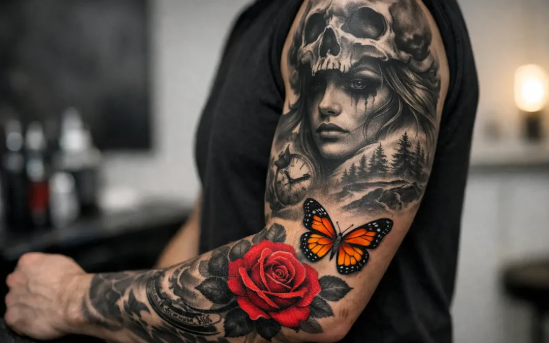
A single red rose in a black-and-grey portrait. Gold eyes on a detailed tiger. One blue butterfly lifting off a grayscale memorial piece. Black and grey tattoos with a pop of color work because they create a clear focal point without asking every inch of skin to compete for attention. The effect can feel cinematic, personal, and bold, but only when the color has a purpose.
This is not simply a black-and-grey tattoo with one random bright detail added at the end. It is a design choice that begins with composition. The contrast between soft shading, solid blacks, skin breaks, and selective color has to be planned from the first conversation. Done well, it gives your tattoo a visual hierarchy: your eye knows exactly where to land.
Why This Style Makes an Impact
Black and grey has lasting appeal for a reason. It brings depth, texture, and emotion without relying on a full palette. Portraits can feel more dramatic, religious imagery can feel more reverent, and realism can carry a strong sense of dimension through careful shading alone.
A controlled shot of color changes the energy. It can represent a person, a memory, a mood, or one defining element of the story. A yellow raincoat in a storm scene, a purple flower on a memorial piece, or a rich green eye in an animal portrait can turn a technically strong tattoo into something unmistakably yours.
The restraint is the point. When color appears in only one or two places, the surrounding black and grey gives it room to breathe. That contrast is why a small color accent can read more powerfully than a full-color design.
Black and Grey Tattoos With a Pop of Color Need a Plan
The best designs answer one question early: what deserves the color? The answer should be meaningful or visually necessary. Sometimes that means a birth flower, a loved one’s favorite color, a team-inspired detail, or a symbolic object. Other times, it is purely compositional, such as using warm color to draw attention to a face within a larger sleeve.
An artist will also consider placement. A color detail near the center of the composition often becomes the natural focal point. Put several bright accents at opposite ends of a tattoo, and the piece can start to feel scattered. On a large sleeve or back piece, color can help connect separate scenes. On a smaller tattoo, one accent is usually enough.
Scale matters just as much. A tiny dot of color may be too subtle once the tattoo settles into the skin, especially in an area with a lot of motion or sun exposure. On the other hand, making the colored area too large can overwhelm the black-and-grey foundation. Your artist should balance the amount of color with the level of detail around it.
Designs That Suit the Style
This approach is flexible, but certain tattoo concepts naturally benefit from it. Portrait tattoos can use color in the eyes, lips, jewelry, clothing, or a meaningful background element. The color should support the likeness rather than distract from it.
Floral designs are another strong fit. A grayscale rose with deep red petals at the center, or a black-and-grey botanical piece with one blue flower, creates a refined contrast. The same principle works beautifully in Japanese-inspired tattoos, where a colored koi, maple leaf, mask detail, or peony can stand against wind bars, clouds, waves, and black-and-grey background shading.
Animal tattoos offer plenty of opportunity as well. A wolf with amber eyes, a black panther with green eyes, or a lion with a gold crown detail can feel intense without becoming overly busy. For memorial tattoos, color can carry especially personal meaning: a ribbon, a birthstone tone, a flower, or a small object connected to the person being honored.
Abstract and fine-line designs can work too, though the strategy changes. In a delicate piece, a small wash of color or a single saturated mark may be more appropriate than heavily packed pigment. The goal is always the same: make the color intentional, not decorative filler.
Choosing the Right Color
There is no universal best color. The right choice depends on your skin tone, the design’s mood, the size of the tattoo, and how visible you want the accent to be from a distance. Red, blue, and gold tend to create immediate contrast against black and grey. Softer shades can look elegant, but they may read more quietly over time.
Color saturation also affects the result. A bright, heavily saturated red creates a completely different feel than a muted burgundy. Electric blue can look graphic and modern, while a smoky blue wash can feel more atmospheric. During a consultation, it helps to talk about the emotion you want the tattoo to hold, not only the exact color you have in mind.
Your artist may recommend an adjustment based on your skin and the tattoo’s placement. That is not a compromise in quality. It is part of designing artwork that will look strong when healed, not only when it is fresh.
Think About Aging Before You Commit
Every tattoo changes with time, and color accents are no exception. Black and grey often softens into a smooth, cohesive look as it ages. Color can remain vivid for years, but its long-term appearance depends on pigment choice, placement, sun exposure, skin care, and how densely the color was applied.
Areas that receive frequent sunlight, such as hands, forearms, shoulders, and feet, may need more attention over the years. Daily sunscreen once the tattoo is fully healed is one of the simplest ways to protect both the grayscale shading and the color. Friction, rapid weight changes, and poor healing habits can affect the look of the entire piece as well.
This does not mean you should avoid color. It means your design should be honest about how you live. If you spend most weekends on the water or work outdoors in Florida, tell your artist. A professional can help you choose placement, scale, and saturation with real life in mind.
The Consultation Is Where the Tattoo Comes Together
Bring references to your consultation, but do not feel pressured to find a perfect finished design online. Reference images are useful for showing style, mood, placement, subject matter, and colors you are drawn to. Your tattoo should not be a copy of someone else’s work. It should be built around your idea, your body, and the way the piece will flow with your existing tattoos.
Be ready to discuss size honestly. Detail needs room, especially in black-and-grey realism. If you want a portrait, flowers, background elements, and a vivid color accent in one area, going too small can sacrifice clarity. A good artist will explain where the design needs breathing room and where simplifying will actually make it stronger.
At Socrates Ink Gallery, the custom process starts with listening to the story behind the idea. From there, the design can be shaped around the elements that matter most, whether that is a single red detail in a family portrait or a carefully placed koi in a larger Japanese-inspired sleeve.
Trust Restraint and Craft
The temptation with a color accent tattoo is to keep adding more. Another flower, another eye color, another bright object. Sometimes that works for a large, layered project. Often, it weakens the main idea.
Strong tattoo design is not about using every available element. It is about knowing what to leave out. Give the black and grey room to create shadow and depth. Let the color carry the emotional weight. When the design has a clear focal point and the application is clean, the result feels intentional from across the room and rewarding up close.
If you are considering this style, start with the one detail you never want the piece to lose. That is often where the color belongs.