
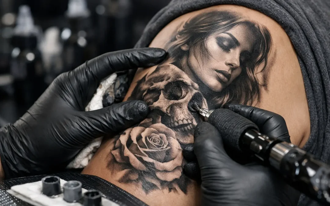
A black and grey tattoo can look powerful with nothing more than ink, skin tone, and a well-planned range of values. That simplicity is exactly what makes it demanding. Learning how to shade black and grey tattoos means learning to control light, depth, texture, and contrast without relying on color to separate every detail.
The goal is not to make every area dark. Great black and grey work gives the eye somewhere to rest, then creates emphasis with carefully placed shadows. Whether the design is a portrait, a full sleeve, a religious piece, or a fine-line tattoo, the strongest shading starts long before the machine touches the skin.
How to Shade Black and Grey Tattoos With Depth
Think of shading as the structure underneath the design. A rose needs dark areas behind folded petals. A portrait needs shadows that describe the planes of the face. A Japanese-inspired sleeve needs enough contrast to keep each figure, wave, and background element readable from a distance.
Before shading begins, establish the light source. Decide where the light is coming from and stay consistent. If light hits from the upper left, the deepest shadows should generally fall on the lower right sides of forms, in recessed spaces, and beneath overlapping elements. Random dark spots may look dramatic in the moment, but they flatten the composition once the tattoo heals.
It also helps to identify the design’s full value range before beginning. Black is the deepest point, bare skin is usually the brightest highlight, and diluted grey washes create the transitions in between. Not every tattoo needs every possible grey value. A delicate design may need a narrower, softer range, while a realism portrait often needs richer blacks and more gradual tonal steps.
Plan the Black Before You Build the Grey
The temptation with black and grey work is to shade everything evenly until the tattoo feels finished. That approach often produces a cloudy result. Instead, place the darkest blacks with intention first. These areas anchor the composition and establish the contrast that lets the lighter greys read clearly.
Deep black works best in places where the design naturally calls for visual weight: behind a main subject, inside the deepest folds of fabric, around the base of an object, or in negative spaces that need separation. A background does not need to be solid black to do its job. Soft black-and-grey fades can push a subject forward while keeping the piece open and breathable.
From there, work outward into grey values. Each pass should have a purpose. Ask whether the grey is describing form, creating atmosphere, separating two elements, or smoothing a transition. If it does none of those things, it may be unnecessary.
This is especially important in large projects. A sleeve can lose its hierarchy when every image is shaded to the same intensity. Leaving intentional skin breaks and lighter zones makes the overall tattoo easier to read and gives it more longevity.
Choose the Right Shading Movement
Technique should match the texture and shape you are trying to create. Smooth realism, smoky backgrounds, and gritty texture all call for different hand movements and needle choices.
Whip shading is commonly used for soft fades. The artist enters the skin with controlled pressure and lifts out gradually, allowing the end of the stroke to disperse. Overlapping these passes can create a smooth transition from dark to light, but too much repetition in one area can overwork the skin and make the healed result less predictable.
Pendulum shading uses a gentle back-and-forth motion to build soft tone over a wider area. It can be useful for rounded forms, background gradients, and subtle shadows. The key is consistency. Uneven speed, pressure, or overlap creates patchiness that is difficult to hide later.
Stippling and pepper shading use spaced dots or a broken texture rather than a solid wash. This approach can bring a lighter, more atmospheric feel to fine-line tattoos and can age gracefully when it is placed with enough room to breathe. It is not the best answer for every design, though. A realistic portrait with heavy stippling may lose the smooth skin-like transitions that make realism convincing.
A skilled artist adjusts machine settings, hand speed, needle grouping, and ink dilution as the work develops. There is no single voltage or needle configuration that produces perfect black and grey shading for every tattoo. Skin type, placement, desired texture, and the scale of the design all matter.
Build Smooth Grey Washes, Not Muddy Ones
Grey wash is not simply watered-down black. It is a controlled range of diluted black inks that allows the artist to move between light and dark without harsh jumps. A thoughtful wash set creates options. It helps build a soft cheek shadow in a portrait, a gradual fade behind lettering, or depth in a floral design without turning the entire tattoo into one flat grey mass.
Work from light to dark when the design requires delicate transitions, especially on lighter skin or in areas where highlights need to remain clean. This makes it easier to preserve openness. In other situations, starting with the darkest shadows can establish the map of the piece before softer tones are layered around them. The right order depends on the image and the artist’s process.
What matters most is avoiding over-saturation. When too much grey is packed into every open area, the tattoo can heal darker than intended. Fresh tattoos also look more dramatic than healed tattoos because the skin is irritated and the surface is wet with ointment. Experienced artists shade with the healed result in mind, not just the immediate photo.
Protect Highlights and Negative Space
In black and grey tattooing, untouched skin is often the brightest color in the piece. Highlights in an eye, a metal edge, a petal, or a drop of water may depend entirely on a clean skin break. Once that area is unnecessarily shaded, getting the brightness back is difficult.
Map highlights early and protect them throughout the session. If the design is complex, it can help to think in three levels: the brightest highlights, the midtone body of the image, and the darkest accents. That simple framework prevents the midtones from swallowing the light.
Negative space deserves the same attention. Open skin around a subject can be more effective than another layer of background smoke. It creates contrast without additional trauma to the skin and gives the design room to age with clarity. This is one reason custom planning matters. A tattoo should fit the body and the surrounding space, not just fill every available inch.
Adjust for Placement, Skin, and Healing
A shading plan that works beautifully on the upper arm may need to change on the ribs, hand, knee, or inner bicep. Areas with thinner skin, frequent movement, or more sun exposure can heal differently and may not hold subtle transitions in the same way. Small tattoos also have less room for gradual fades, so they often benefit from simpler shading and stronger contrast.
Skin tone is part of the artistic conversation as well. Black and grey tattoos can look striking on a broad range of skin tones, but the value range must be designed for the individual client. On deeper skin tones, relying on very pale grey for key details may not create enough visible separation after healing. Strategic contrast, clean outlines where appropriate, and intentional negative space can carry the design more effectively.
Aftercare affects the final look. Keep the tattoo clean, follow the artist’s aftercare directions, avoid picking or scratching, and protect it from unnecessary sun exposure once healed. No shading technique can fully compensate for poor healing habits. A tattoo is a collaboration between the artist’s craft and the client’s care in the days that follow.
Know When a Custom Artist Makes the Difference
Black and grey shading is not about making a design darker. It is about making it dimensional, readable, and personal. A clean reference image can help, but a professional consultation is where the real decisions happen: how the design fits your anatomy, where the focal point belongs, how much contrast the piece needs, and what will still look intentional years from now.
At Socrates Ink Gallery, the custom process is built around those decisions, not a one-size-fits-all stencil. Bring the idea, the reference, or the story you want to carry. The right shading plan can turn it into artwork that has weight, movement, and a clear point of view.